From the Voids

concept, text & layout

To approach H. P. Lovecraft today is not only a matter of interpretation, but of presentation. The ways in which his texts are framed, commented upon, and visually structured shape how they are understood. This book treats typography and editorial design not as neutral containers, but as active instruments of thought. They are used to articulate complexity, to separate voices without isolating them, and to make tensions visible rather than smoothing them over.

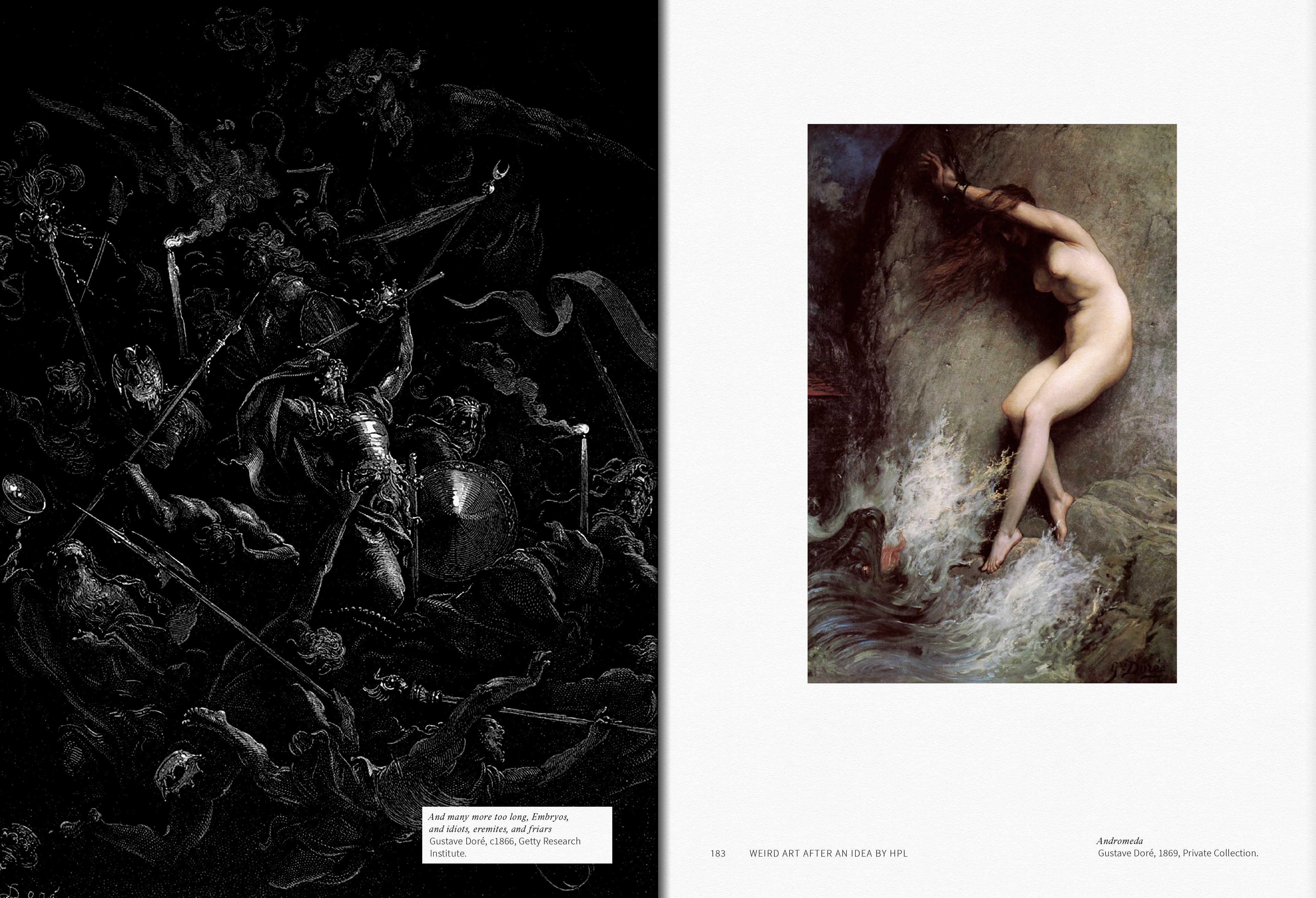
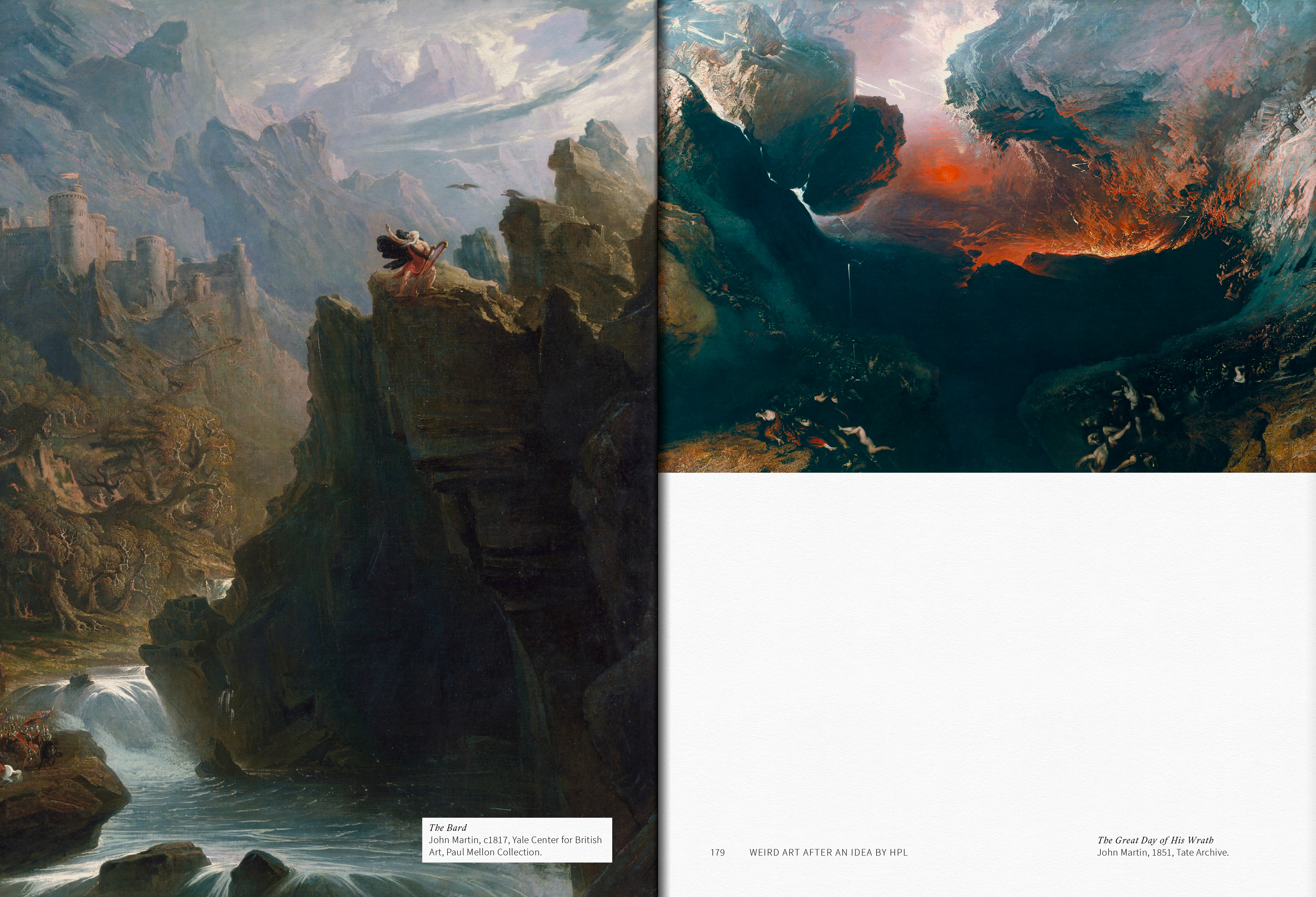
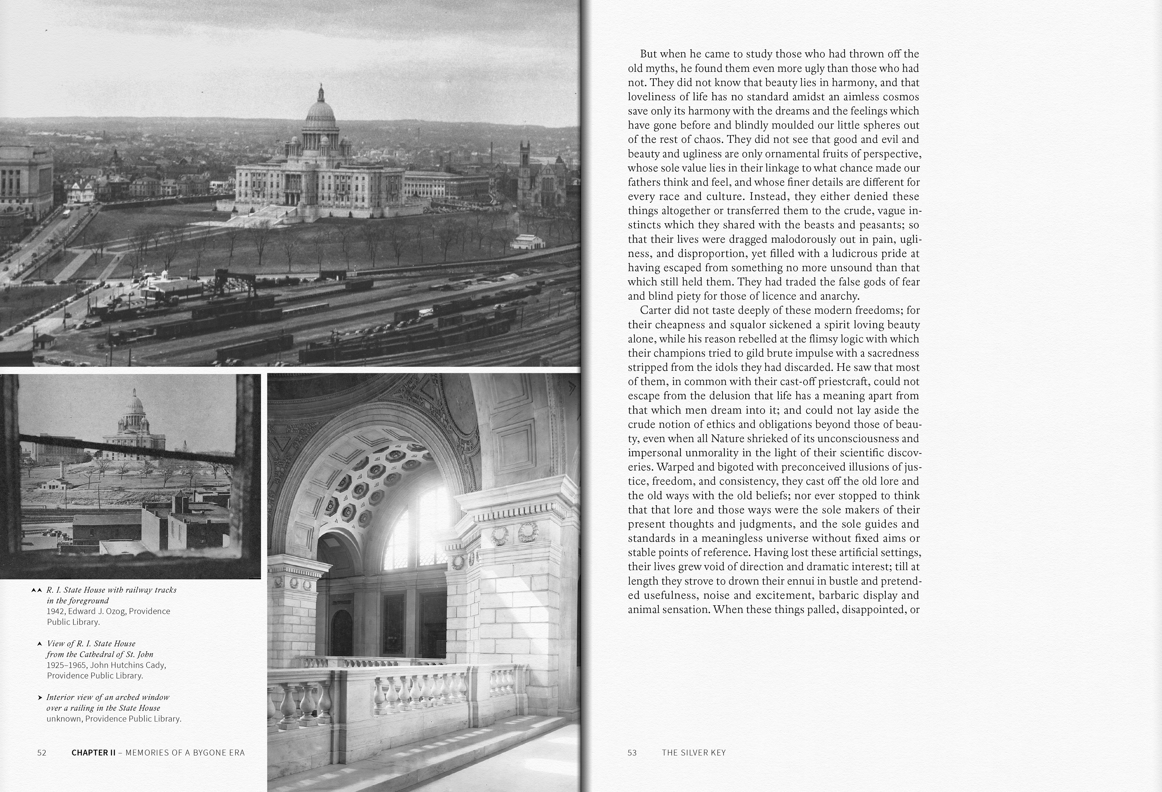
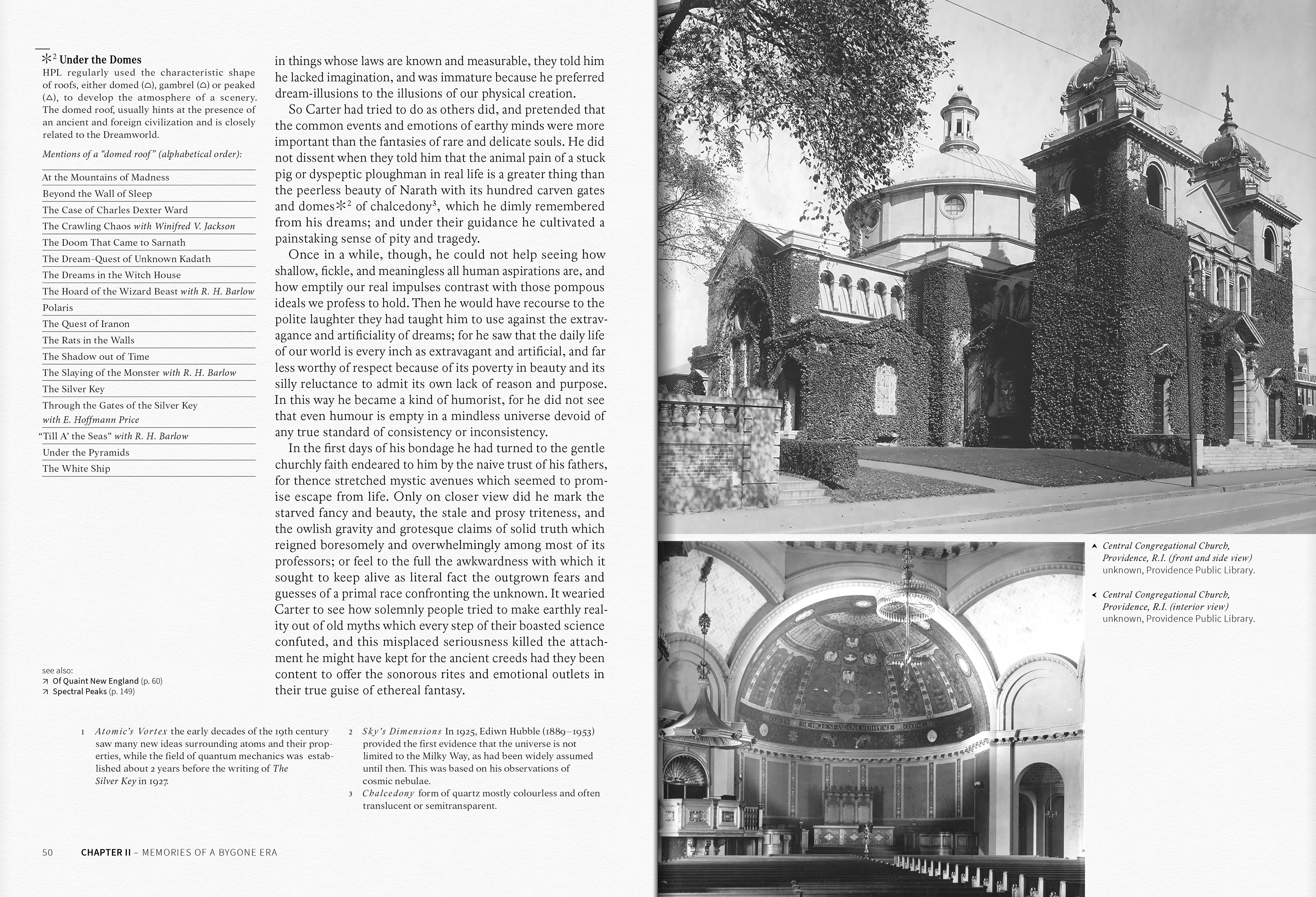
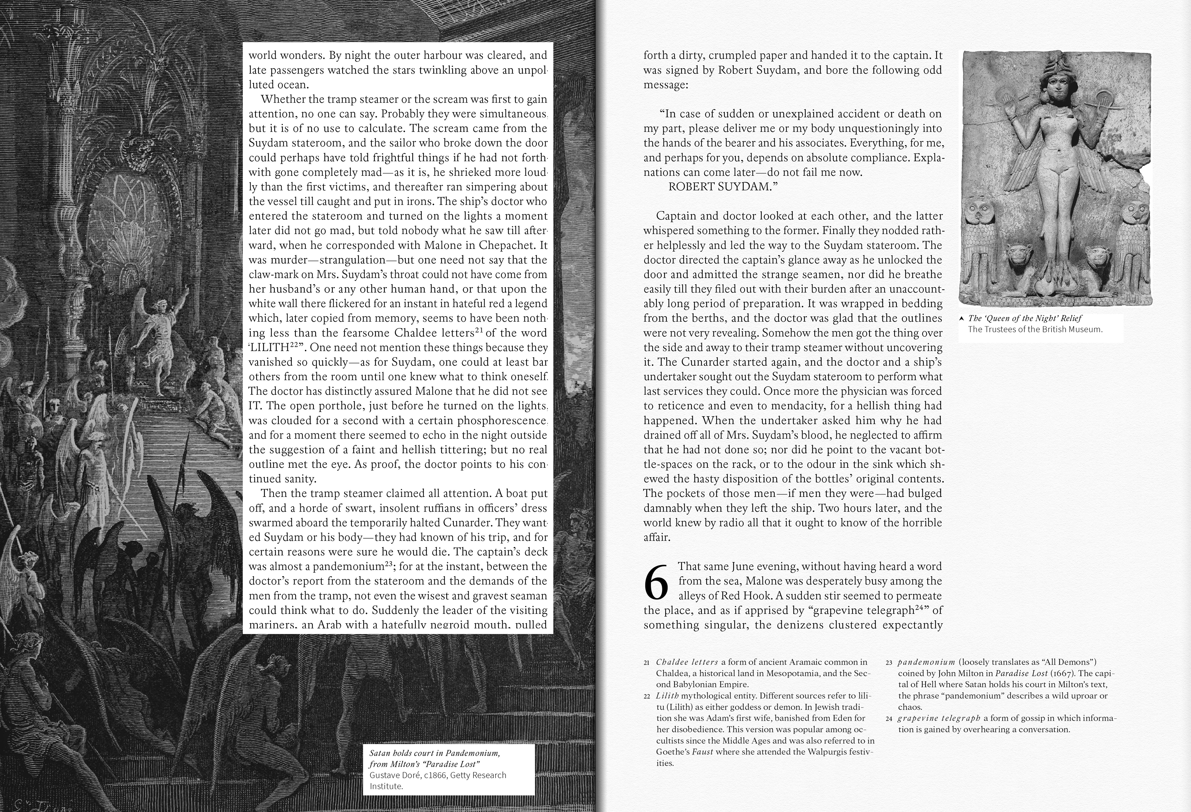
Example spread illustrating layered annotation: footnotes (bottom) clarify terms within the text, a contextual annotation (marginalia) introduces a Lovecraft-specific theme, and supporting imagery expands the short story’s interpretive frame.

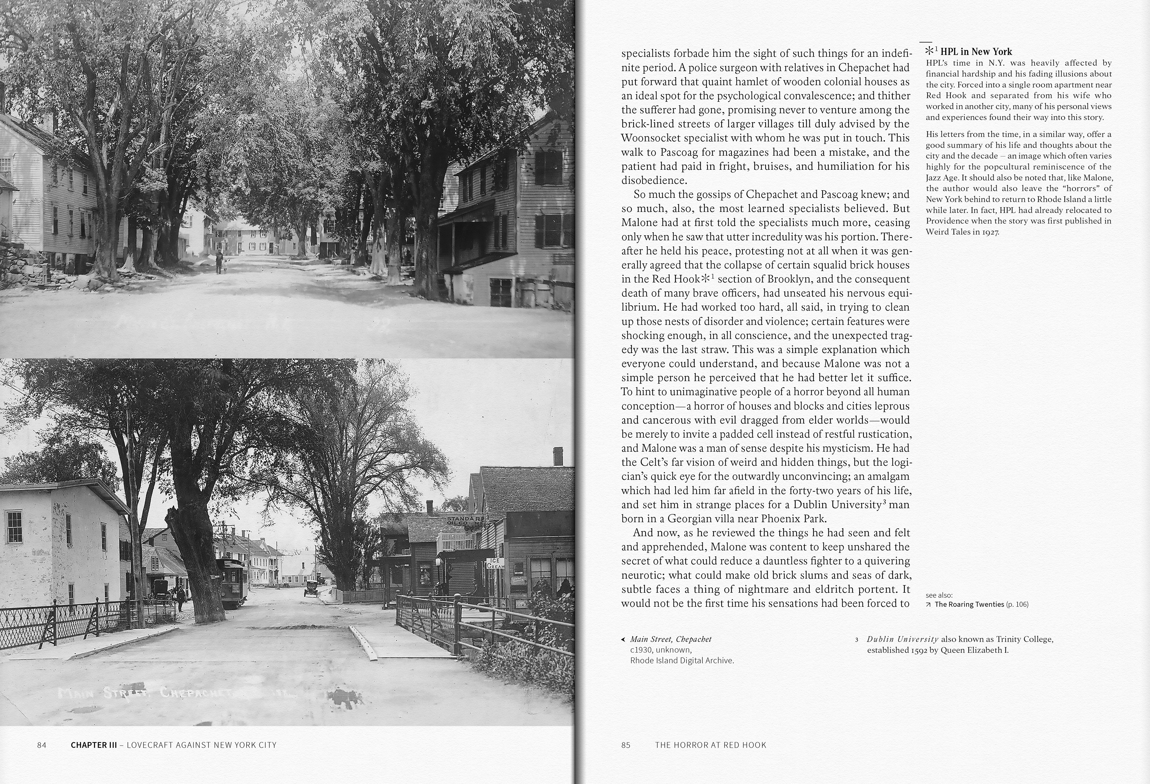
Alternative annotated spread: a more visually layout intensifies the interplay of text, annotation, and imagery, emphasizing aesthetic variation while preserving scholarly clarity.

Lovecraft’s work exists within a dense web of references: literary traditions, scientific speculation, personal correspondence, and later critical responses. Presenting this material linearly would obscure more than it reveals. Instead, the editorial structure adopted here allows multiple layers of information to coexist on the page. Primary texts, annotations, contextual essays, and source references are arranged so that relationships between them can be traced, compared, and questioned. Visual hierarchy becomes a means of differentiation, enabling readers to navigate complexity without reducing it.

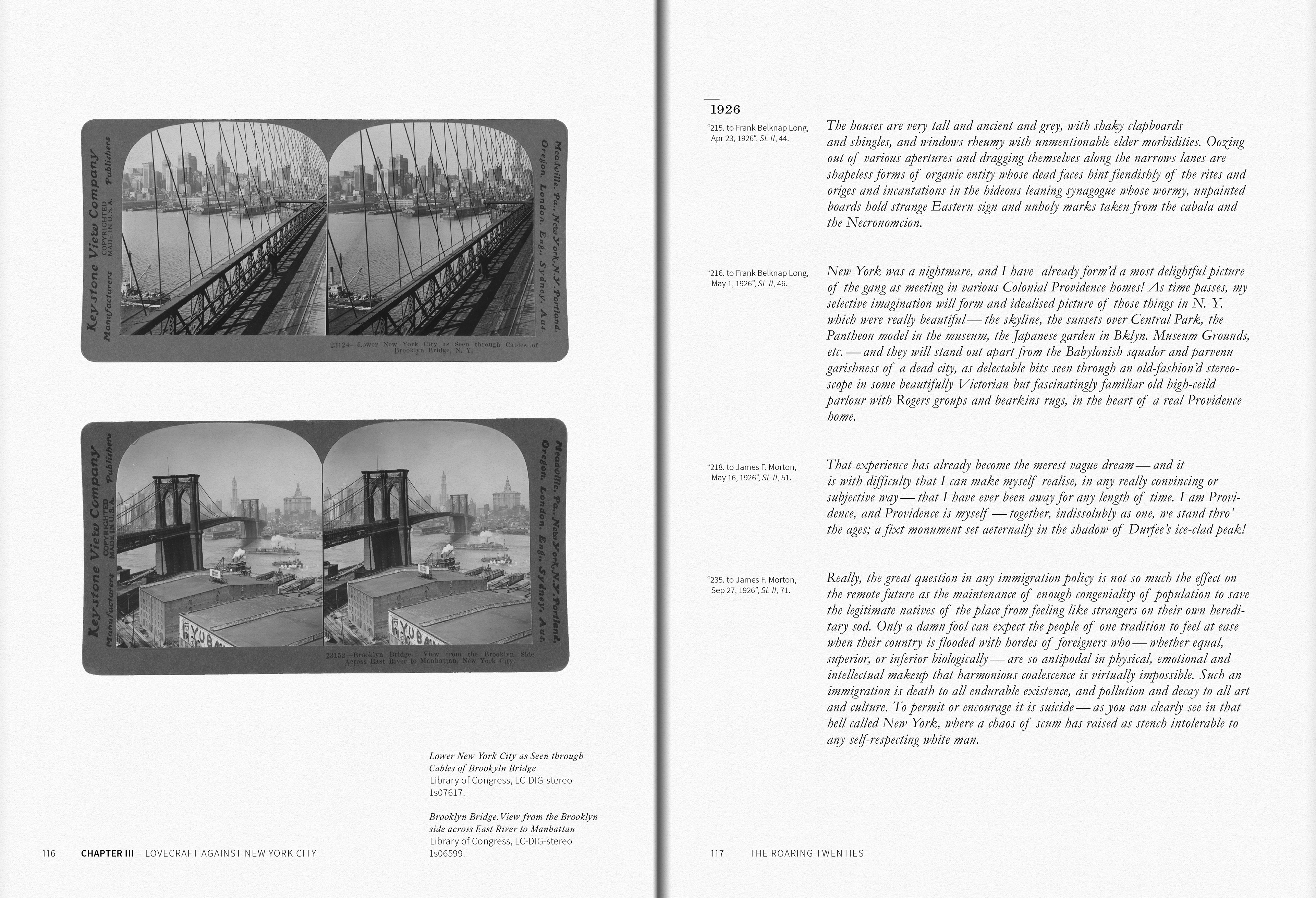
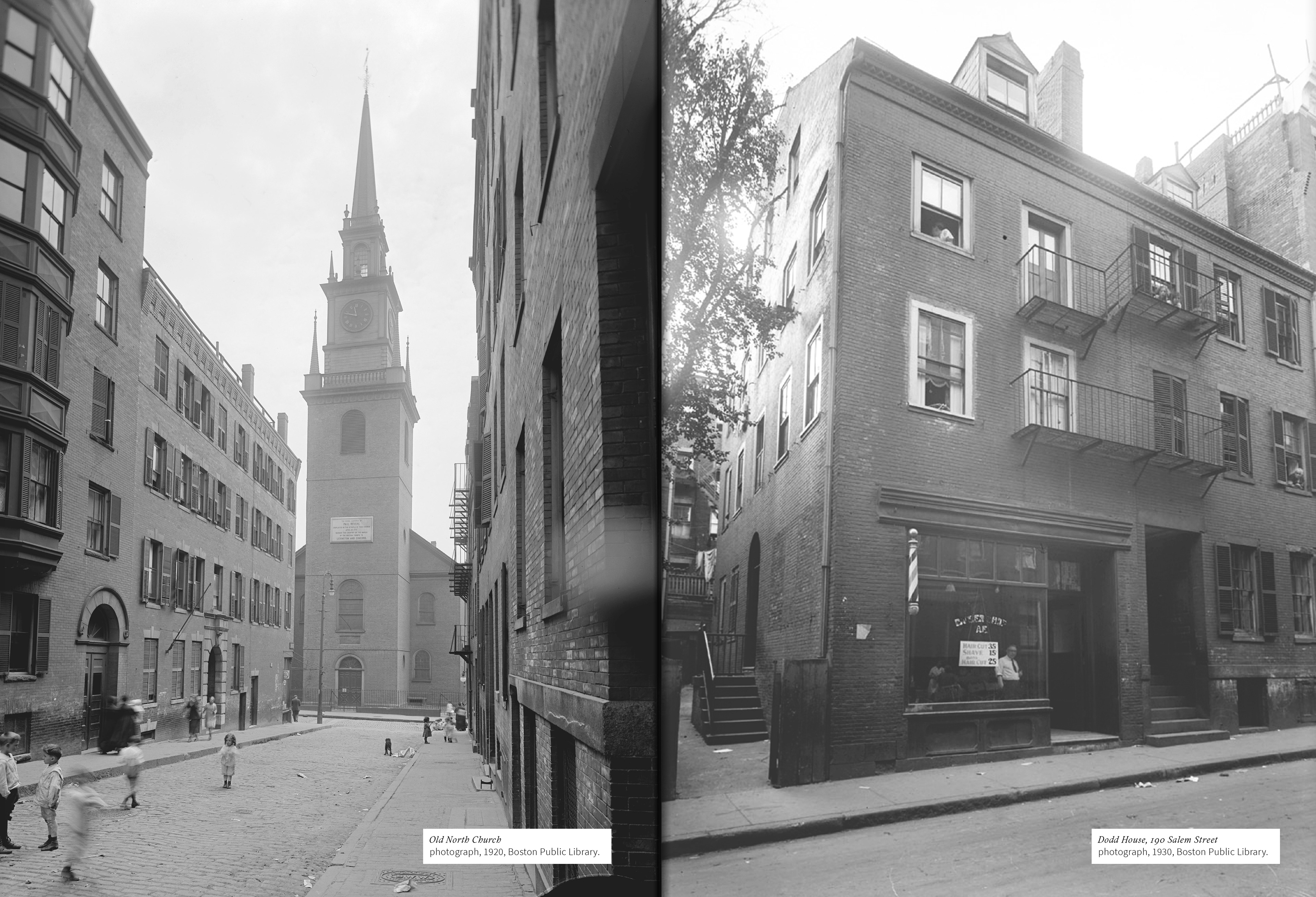
Annotated letter spread: excerpts from Lovecraft’s correspondence on New York are juxtaposed with contemporary stereographs, contrasting subjective commentary with period visual perspectives on the city.

This approach is particularly crucial when dealing with Lovecraft’s ideological positions. His fiction, letters, and essays often pull in different directions, and their contradictions cannot be responsibly addressed through selective quotation or isolated readings. By juxtaposing sources and maintaining their provenance, the book insists on a form of reading that is both critical and accountable. Typography, in this sense, functions as an ethical tool: it marks distance, signals quotation, and prevents interpretive shortcuts.

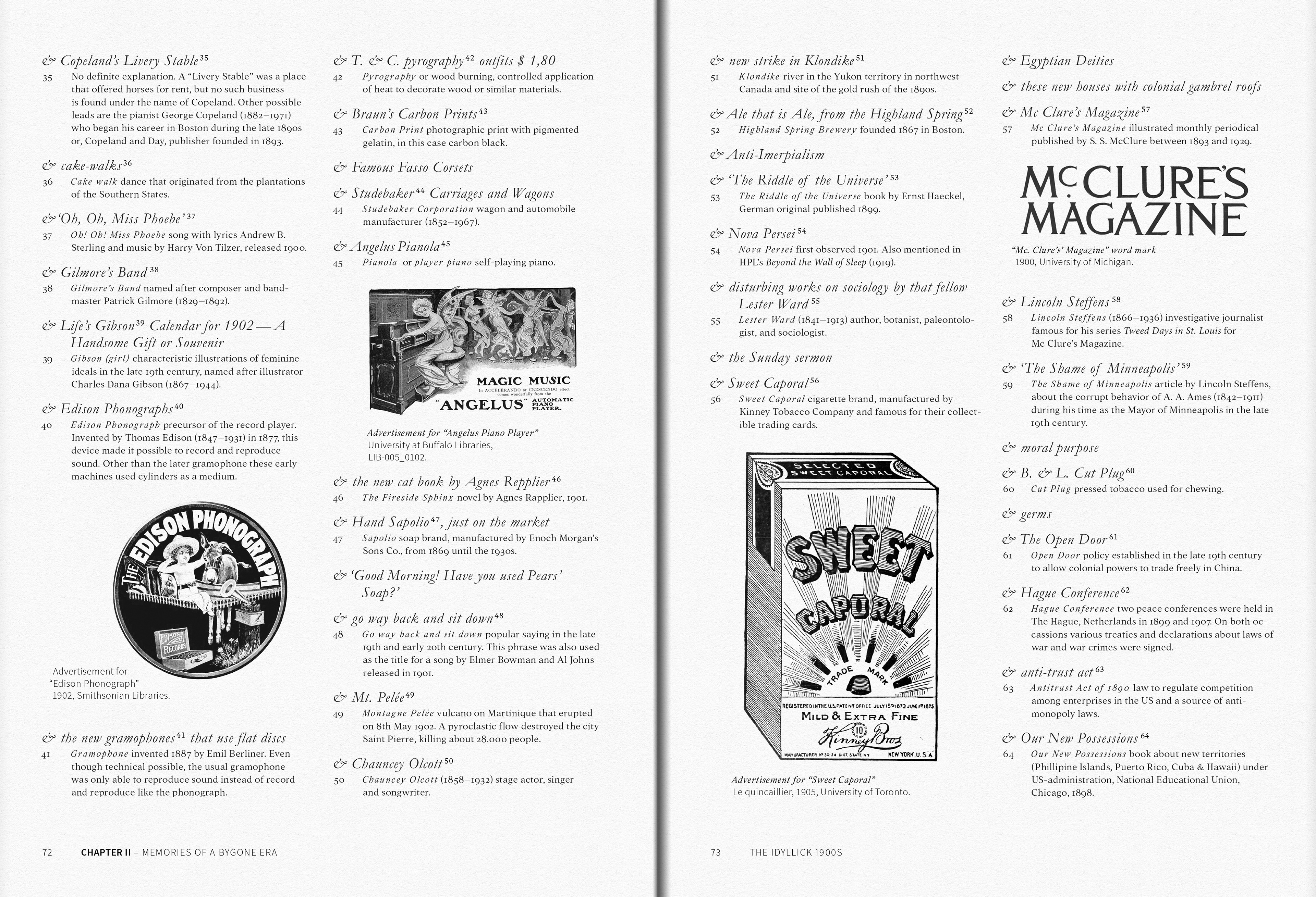
Annotated letter detail: Lovecraft’s recollections of childhood — ranging from musical pieces and current events to household brands — are extensively glossed and illustrated, linking personal memory to its material and cultural context.

Information
From the Voids – Selected Works by H. P. Lovecraft
hardcover, 216 pages
2026
Back to Top